
BEM - Breaking down designs
Recently tacked onto the end of CSS pre-processor workshop I was running, I threw in a fifteen-minute introduction to BEM. Now I am not sure if this was a comment on the workshop or the BEM introduction but people sat up, they were noticeably more engaged and seemed to hang on every word. OK, now I am over-egging the pudding, but it did make me realise that there are newish web FEDs out there who want a quick start guide to help them be productive as quickly as possible. So here I am with what will hopefully be the first in a series of blogs.
What has this got to do with getting started?
It will help you break down the designs you are tasked with producing into the rectangular segments your web page is going to be built from.
What is BEM?
In brief, as you can trawl the internet as well as I can, BEM is a CSS selector class naming convention. It suggests naming your classes by blocks, elements and modifiers hence BEM. When used correctly you will find that BEM helps:
Why use BEM?
- Reduce CSS specificity.
- Reduce SCSS depth (I’ll come back to SCSS in another post).
- Improves reusability/transferability of your CSS.
- Encourages you not use tag names and IDs for CSS selectors (crikey my drafts folder is filling up).
What does it look like?
There are various formats, but all boil down to a way of referencing your HTML elements by:
- Block - the section of the page or component the element is owned by.
- Element - the purpose of the element, often a functional name for the element
- Modifier - special cases or states for the element.
My personal preference is for the style defined by Harry Roberts (.scss-lint.yml configuration at the bottom of this post). Which looks like this:
block__element--modifier
Note:
- Elements are optional, bur frequently used.
- Modifiers are optional, but less frequently used.
- Blocks, elements and modifiers can be hyphenated to allow verbose names which I would recommend.
- The class names consist only of lowercase letters, underscores and hyphens.
BEMIT
Harry now prefers BEMIT which extends the BEM syntax with suffixes for media queries and a Hungarian notation like prefix. Personally, I find it makes the class names less readable, so while I do add a ‘js-‘ to the start of any javascript selectors, I otherwise stick to BEM.
The reason for using the ‘js-‘ prefix is that it provides a seperation between classes used to style the element and classes used to interact with an element via code. This means it is clear to anyone making future changes what the impact is of changing or re-using a class.
In practice
Blocks - Structural sections of a page
Breaking up a page into structural blocks should not be a difficult task, simply draw rectangles around the main blocks on a page. Break out some wax crayons; this will really impress your designer, or magical web based collaboration tool of your choice and get boxy assigning names to blocks as you go.
At this point you can marvel at my animation skills below to discover the block classes assigned to the parts of the page below, the landing page on Github. Hover or tap to reveal all including the amazing color scheme in it’s full glory.
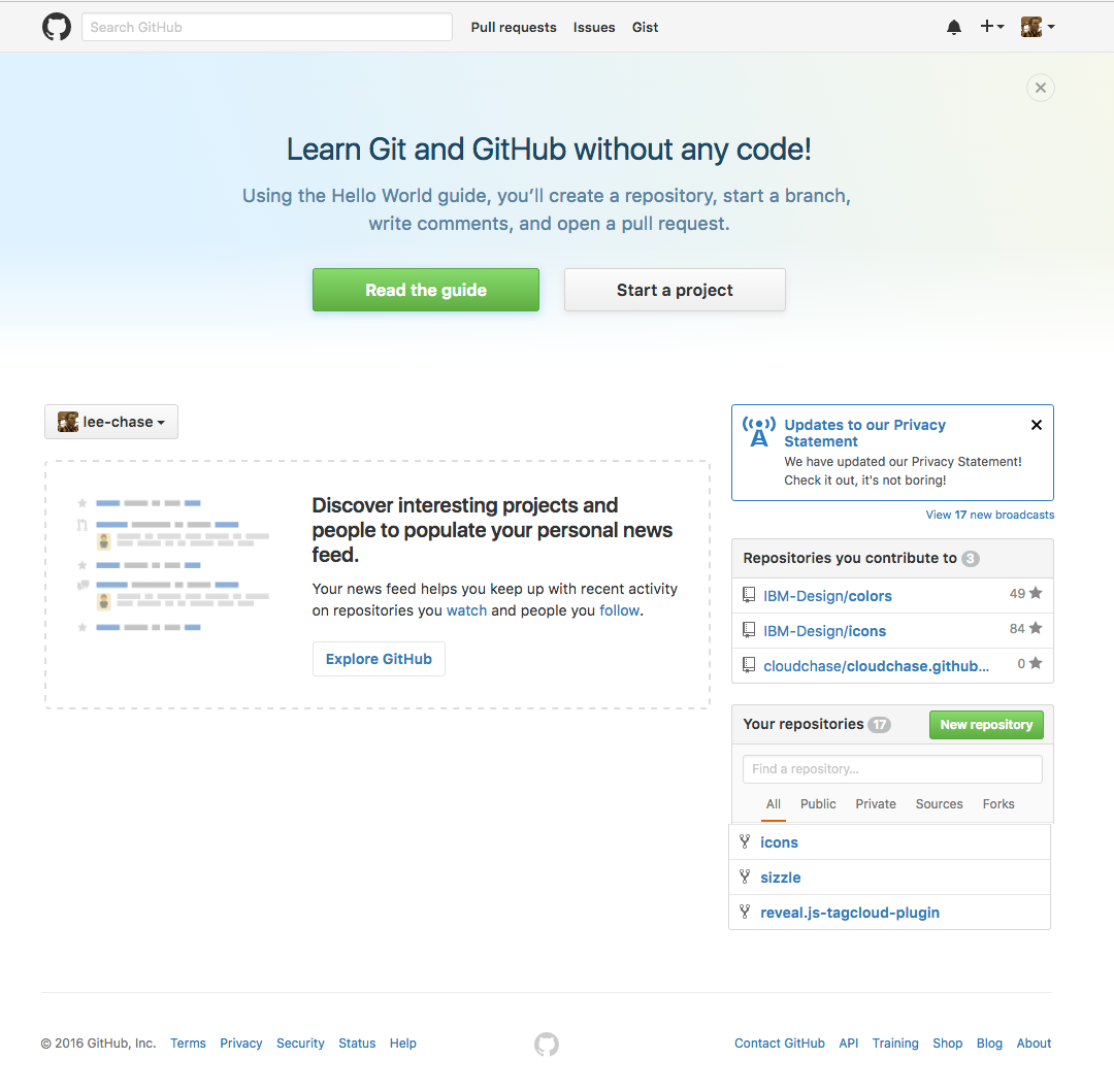
They blocks identified are…
- header
- notification-panel
- main-content
- aside
- footer
When it comes to creating classes for elements contained in these blocks, they will all start with one of these block names.
Blocks - often are components
Assigning blocks to components is even easier than pages, as the majority of components are blocks. OK, I am sure we can all imagine outlandishly complicated components that require several blocks, but most of the time these are components that fill a substantial portion of a page, and that can be broken down in the same way. Just add the component name somewhere (consistently) in each of its hyphenated block names.
In the simpler cases your just going to end up with component names like; cool-carousel, snazzy-menu, big-red-button, funky-notification-panel, etc.
Elements - Structural and component
Inside your structural or component blocks assign element names to your HTML tags. This will range from structural parts of your component to instances of other components. Obviously you could choose to name structural parts of a component with a hyphenated block name, but I’d only do that with large components that require extra breaking down.
Time for some more exciting animation, first show structural sections of a component. The bootstrap carousel from w3schools in this case.
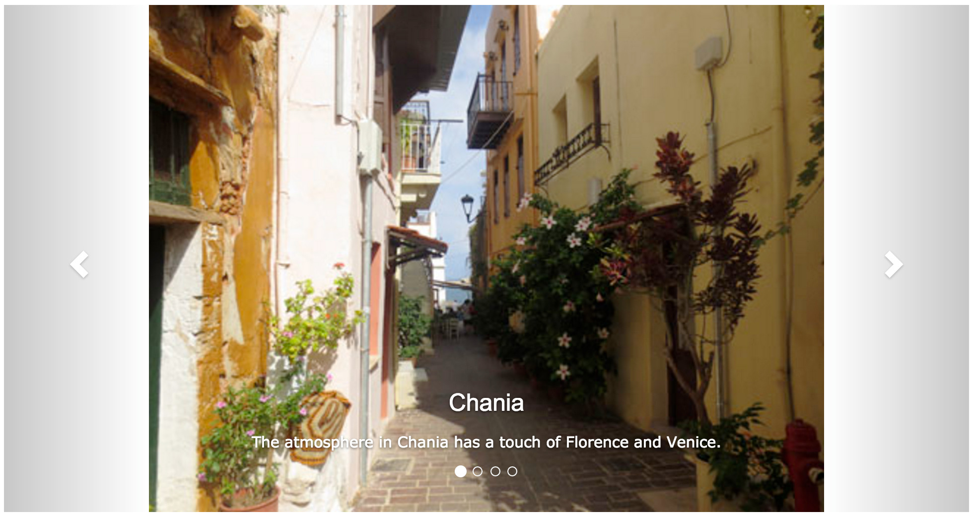
Just to re-emphasise, all of the elements are prefixed by the block name.
The structural block__element list above is:
- carousel__main
- carousel__left-panel
- carousel__right-panel
- carousel__bottom-panel
Next up, element names for components in the block. This time we identify all remaining elements that need styling.
The list this time reads:
- carousel__left-nav
- js-carousel__left-nav
- carousel__right-nav
- js-carousel__right-nav
- carousel__title
- carousel__desccription
- carousel__quick-nav
- js-carousel__quick-nav
It is interesting to note that this is the first and only time I have included the js- prefix. This is because it is at the element level you are likely to have most of your user interface logic plumbed into. You may have javascript plumbed in elsewhere, perhaps to populate a carousel for instance. I would recommend you always follow the pattern shown here of duplicating the CSS selector class, and giving it a js- prefix for the separation of concerns previously outlined.
Modifiers - State / Alternate Versions
Modifiers can be used to either define alternative versionsstate in cases where you use code to set a state value.
The modifiers chosen above are:
- carousel__left-nav–first
- carousel__right-nav–last
- carousel__right-nav–big-arrow
- carousel__quick-nav–selected
- carousel__quick-nav–stickman
Here we have alternative versions for the left, right and quick nav buttons. The quick nav also has it’s state carousel__quick-nav–selected identified so we can style it.
Verbose HTML v Verbose CSS
I often find myself assigning both block__element and block__element–modifier to an HTML element. This allows me to keep the core behvior assigned to the block__element selector and the alternative to block__element–modifier. Keeping my CSS tiday comes at the price of making my HTML more verbose.
E.g.
.carousel__quick-nav {
  // core css
}

.carousel__quick-nav--stickman {
  // stickman css
}
However this is just personal preference, you may prefer the following which makes your HTML less verbose.
.carousel__quick-nav,
.carousel__quick-nav--stickman {
  // core css
}

.carousel__quick-nav--stickman {
  // stickman css
}
A challenge
Go practice, pick on your favourite web-based email client and break it down using BEM. I guarantee when you come back a couple of days later you will find stuff you missed the first time.
Final words
If you have questions, suggestions for posts or the desire to crowd fund me a beer you can get in touch on github, twitter, pigeon, cups and string etc.
.scss-lint.yml configurations
Yes, you should be linting your scss.
SelectorFormat:
  enabled: true
  ## or 'strict_BEM' or 'hyphenated_lowercase', or 'strict_BEM', or 'snake_case', or 'camel_case', or a regex pattern
  convention: ^[a-z]([-]?[a-z0-9]+)*(__[a-z0-9]([-]?[a-z0-9]+)*)?(--[a-z0-9]([-]?[a-z0-9]+)*)?$
  convention_explanation: 'should match Harry Roberts'' style BEM block[__element][--modifier]'