
FED tips, tricks and pure evil
FED - Who me?
So you have landed yourself, or been landed in, a web Font End Development role. Well as you are reading this blog there is a high probability that this is either early in your FED career, you are a jack of all trades developer, or you are a non-FED drafted in to plug a resource gap in a project A.r.r.1.
A restrained rant 1: Would you ask an electrician to fit a new floor, a dentist to perform eye surgery or a cat to fetch a stick?
So What?
Well, here I will write about the tips and tricks of an experienced FED as well as discuss the pure evil you should know about and avoid. Initially, as I have to do some actual work, this post will start small and work its way up to something more useful.
1. Always prefer declarative to imperative
In many ways, this is the software embodiment of Occam’s razor. You should prefer simpler more robust solutions to more complex error prone ones. In front-end development, this means only using javascript (Go, PHP, c# or any other programming language) when you either cannot achieve something in HTML and CSS or it is complex to do so. So if you want text that animates continually between green and red, do not break jQuery out of the box just because it’s there.
OK so I have not implemented the greatest javascript animation loop ever, but hopefully, it demonstrates that writing code is more fragile and complex than the CSS keyframe.
2. CSS - Stop using position relative to relatively position
Position relative has a dual purpose in the world of CSS; Firstly to change the position something is rendered, secondly to not be static.
After some scratching of our collective FED heads at work, not unlike the opening scene in the film 2001, we could only come up with two use cases for position relative. Firstly, and 95% of all we use it for is to host something that is positioned absolutely. Secondly it was to tweak, I said tweak the position of an element by a pixel or few to line it up. This second usecase largely only applies to images hosted in buttons that we want to keep the shape of.
Here is what not to use position relative for, and the alternatives.
Here is an example of when it’s OK, when an icon is too high in a button using position relative to lift it a few pixels.


3. CSS - Position absolutely
Think I just covered that in above. To position absolutely you need to host an element in a relative or fixed positoin element.
4. inline-block heads
Inline blocks are very useful, but they do have a foible for you to find. You see the nice folks that created inline-block figured that you’d be placeing your blocks inline and as a result you’d want space around your inline blocks, much like the spaces between the words of this text. The upshot will be a confused expression on your face when all of your widths add up to 100%, but the content wraps.
Your friend ‘<!– –>’ is the html comment. In order to remove the space between each inline block you must leave none.
<div>
  bla bla bla
</div>
<div>
  wah wah wah
</div>
Is instead written as
<div>
  bla bla bla
</div><!--
--><div>
  wah wah wah
</div>
alternatively
<div>
  bla bla bla
</div
><div>
  wah wah wah
</div>
or
<div>
  bla bla bla
</div><div>
  wah wah wah
</div>
Here is an example of ‘<!– –>’ in action
5. If in doubt box-size: border-box
Elements in HTML sit in a box model.
By default the size of the box is set to ‘content-box’, this means the height and width of the box are those of the content + padding it can contain.
This seemingly quite sensible way to describe a boxes size is usually undone by failure to take account of a border when calculating a box size. E.g. two inline boxes 50% width, with a 1px border will not normally sit on the same row. This is becuase they are in fact 50% + 2px wide. Calculating the size of the box can get a whole lot more complicated in CSS if the boxes are various sizes with different borders that come and go.
In addition when a border is added and / or removed then the size of the box changes, this affects the other elements positioned around it causing them to move.
Coming to your rescue
.my-element {
  box-sizing: border-box;
  border: 5px solid transparent;
}

.my-elemnent:focus {
  border-color: red;
}
box-sizing: border-box;
With this property set on your elements the height and width include the border, making the calculations of box size much easier.
This time however when a border is added and remvoed the content of the element can move, depending on how it’s positioned.
6. Transparent borders - Don’t jiggle about
In order to save the jiggling about that can be caused by the addition and removal of a border, you should use a transparent border. Assuming you’re doing this every where
.my-element {
  box-sizing: border-box;
  border: 5px solid transparent;
}

.my-elemnent:focus {
  border-color: red;
}
Ideally you should only be setting your border size once, updated by changes to border-color and border-style.
7. CSS - Vertical centering
When it comes to aligning your content horizontal gets an easy ride with automatic margins, text-align center etc. Vertical align is a whole lot more fun.
The only tools in the bag used to be either:
- A fudge using veritcal alignment with a tall empty element, usually a :before.
- Using positoin absolute with a transform
While these are handy, and can provide a useful fall back for those having to support older browsers, they should now be ditched in favour of flexbox.
The following example of all three techniques shows that flexbox is the only way to position vertically without adding css to the item being centered.
CSS Selector - Hammer time
Reading about CSS selector specificity is fun https://www.w3.org/TR/2011/REC-CSS2-20110607/cascade.html#specificity
OK. No it’s not so let’s simplify somewhat.
- Do not select by ID
- Do not select by tag name
- Be as non specific as possible.
- Put your css in your css files, not inline
- Do not apply !important Hammer of Thor unless absolutely necessary or the Chitauri are invading.
Taking them one at a time
Do not select by ID
This is no doubt what your css linter will be telling you (please use one, in fact use SCSS, LESS or similar). The main reason is that IDs are fragile, especially in a data driven dom. They also hit harder than class selectors meaning anyone overriding an ID selector will have to also use the ID selector.
In addition to the above CSS selectors for IDs are extremely unlikely to be re-usable in another project.
Do not select by tag name
Selecting by tag is like giving a child free reign in a sweet shop, you are going to end up with far more than you bargained for. The only case for selecting by tag ever is for utility css such as that found in normalize.css and reset.css which attempt level the starting position accross browsers.
Be as non-specific as possible
Given the following HTML
<div class="i-am-outer i-sit-here say-hi-to-mum">
  <div class="another">
    <div class="hello-world">
      Hello World
    </div>
  </div>
</div>
Now you could reference it in css as
div.i-am-outer.i-sit-here.say-hi-to-mum div.another div.hello-world {

}
or
.hello-world {

}
The problem with the former is that if anyone needs to override your css they either have to come later in the css file and use the same level of specificity, or be even more specific. Apart from the extra typing incurred the increased specificity means you will not match a second, third or nth instnace of the class hello-world unless it matches this selector.
Personally I prefer BEM CSS selectors as they load the individual class names with all the specificity needed. Seem BEM breaking down designs
Put your css in your css files, not inline
Not simply a case of separating your concerns, this is because the only way inline css is going to get overridden is with the !important nuclear option.
Do not use !important
!important is the ultimate weapon of mass specificity, but like all ultimate weapons it just leads to an arms race. Now don’t get me wrong I have on occasion beaten a third party component into submission with a !important, but I was only able to do so because the author of the component had not used !important themselves.
There are a small number of cases where !important might make a sense, but I’d still try and avoid where possible. However if you’re having to use !important even here, then maybe you have gone wrong somewhere and should consider refactoring.
.float-it-right {
  float: right !important;
}
8 - Some things cannot be animated - Using just CSS
Some things like:
- Automatic (or rather content driven) heights and widths. You will need to either animate max height, which can look a bit naff, or assign a height calculated in javascript.
- display: none; Better to use a combination of visiblity, opacity, size, overflow, position absolute. Then again you could use javascript - Live example on codepen
9 - Percentage and scroll
Using percentages in elements, or whole pages, that have a scoll bar can cause content to jump by 15px or more :-o
Seriously this can look a bit crap. Instead try to use sizes based on vw, vh or pixels for elements that have scroll bars. This does mean you need to leave some margin space either side of your elements to allow for the scroll bar.
The following images were created using this example on codepen
-
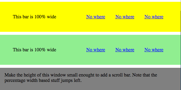
No scroll bar the width is fine 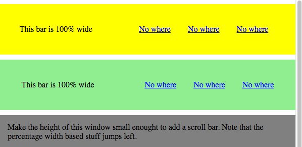
With scroll bar the width 100% is reduced causing the contents to move.
10 - Semantic HTML
Even if you fail to create a full accessible site with WAI-, keyboard access, high contrast and all the other things you will need to about (definitely a separate blog post) the very least you should do is use semantic HTML as it is in your interest.
Looking at the two examples, you may think that no one in their right mind would use anything other than semantic HTML. This is very much a legacy thing as HTML 5 is only four years old (feels longer). Prior to the limited number of semantic elements were either links, form elements or for display purposes.
OK so I went a bit far in replacing links, buttons and headings with <div> elements but hopefully it helps emphasise how much more readible the source of the semantic html is.
11 - Browser differences - Bonus round
FED beware. Even though it is nearly 2017 there are still cross browser issues. Fun failings like IE and Edge not working with auto for one dimension of an SVG. Test here, there and everywhere.
My latest find, Firefox shoe horns in an element for focus. Perhaps you might also ask yourself why the vertical alignment is out if you switch between Firefox and Chrome. Perhaps I need a browser differences post.